A new platform, built to scale
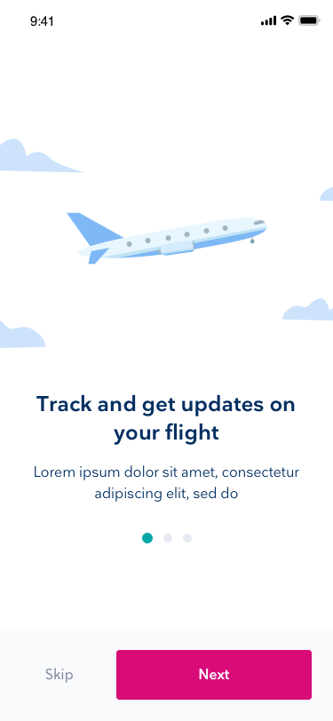
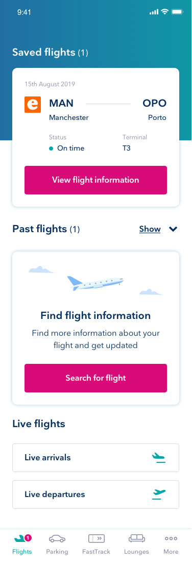
Senior management wanted to move onto a new platform and build better experiences that could still scale, all on React Native. They'd done their homework first. Discovery sessions and fake-door testing had shown that customers wanted a companion app to help them find their way around the airport.
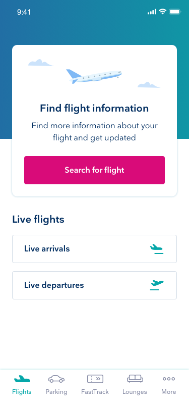
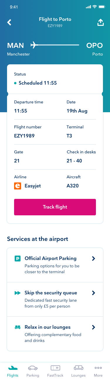
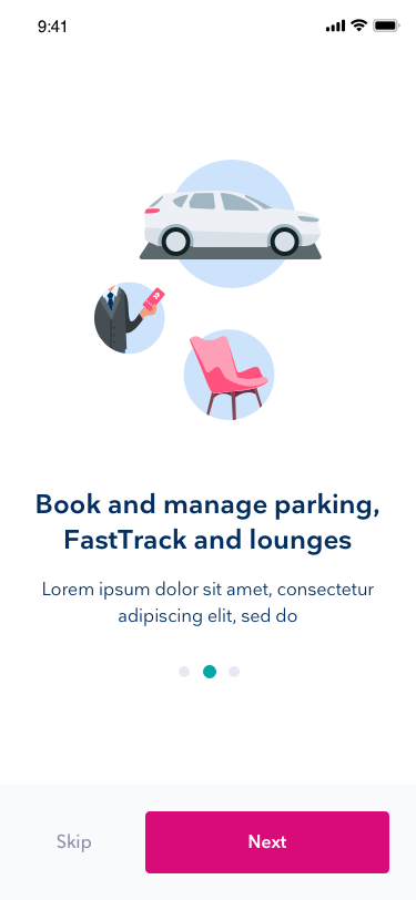
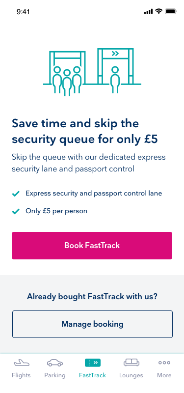
My job was to shape a vision around customer pain points. What we shipped as the MVP was a white-label app built around two things: showing flight information properly, and letting customers buy add-on services on the go, like parking, fast track and lounge tickets. That gave us a foundation for the bigger vision, and something we could sell on to other airports.
The airport is a stressful place
Research showed that getting through an airport is usually stressful. There's a lot to think about and plan, and the excitement of a holiday climbs as the trip gets closer, and so does the anxiety. NPS was low and the same problems kept coming up, so there was a real chance to break the cycle. Three themes stood out:
- Pathfinding. People were confused about where the shops, toilets and gates were.
- Staying up to date. Constantly checking the boards isn't much fun, so people wanted reliable flight info in one place, with alerts when something changed.
- Convenience. A lot of customers had no idea about the services the airport offered.
An app that does the heavy lifting
Out of a focus group, we landed on a companion app where the customer sets up a trip a few weeks ahead and the app does the running for them, building a timeline and feeding small, well-timed bits of information as the trip gets closer. We had plenty of behavioural data to lean on, including user diaries, so we could send notifications at the right moment.
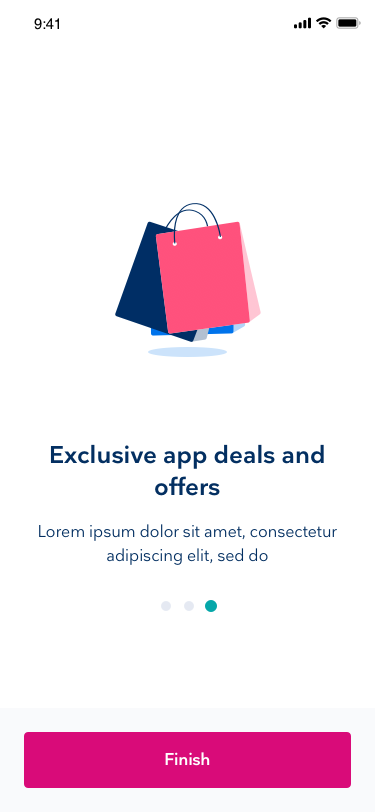
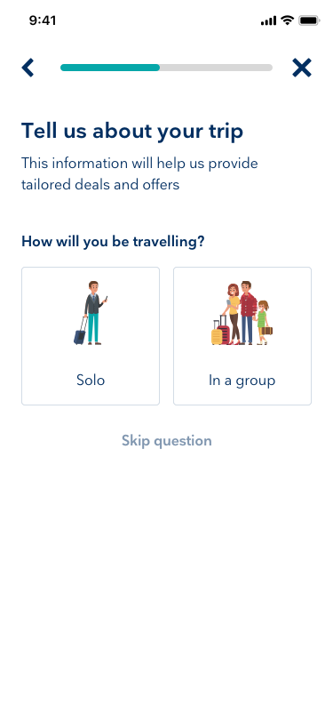
A leisure traveller and a business traveller behave very differently, so we built a quick segmentation flow that let customers tell us a bit more about themselves. That helped the airport put better information, deals and offers in front of them along the way.
How the vision turned into screens
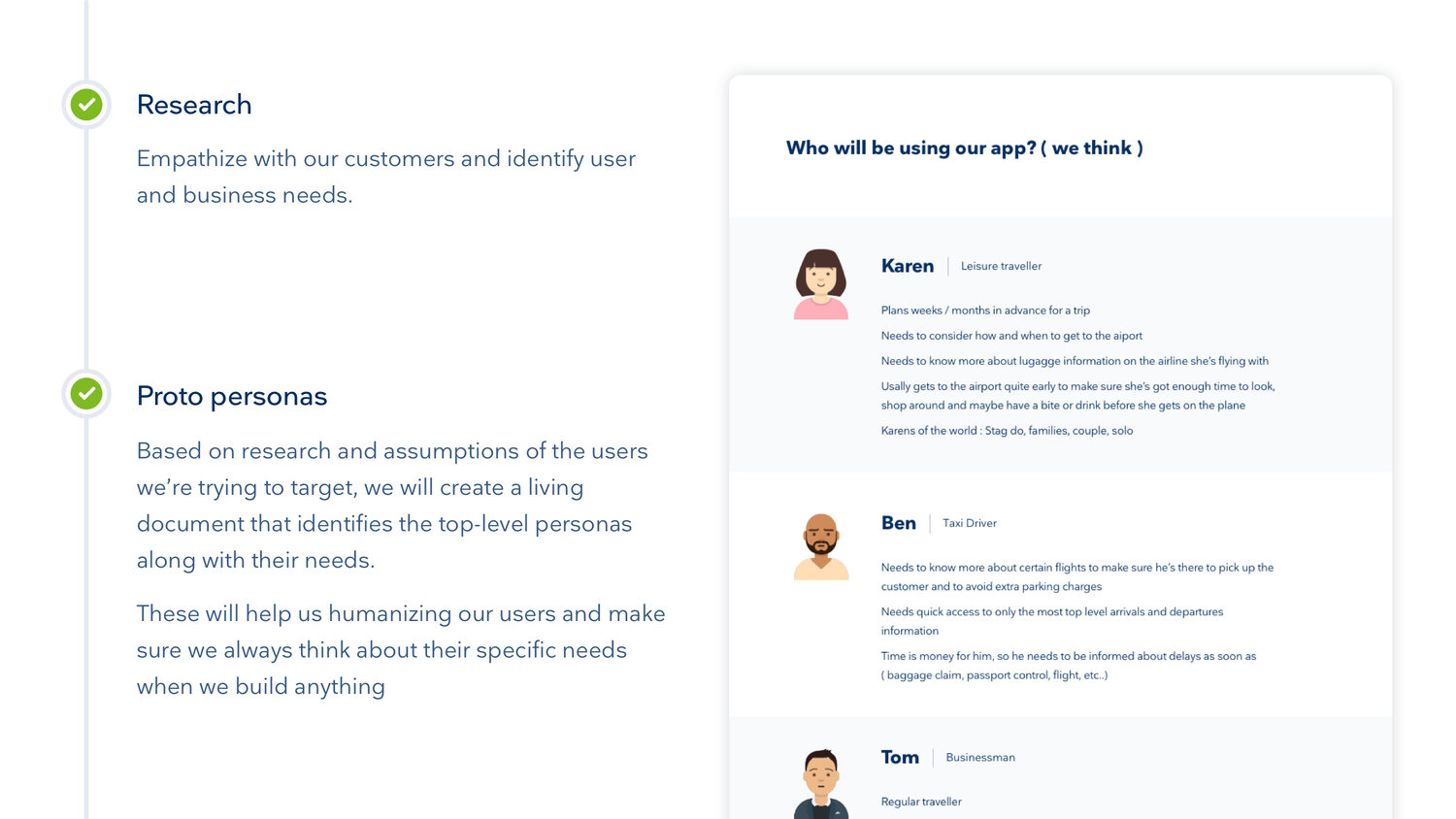
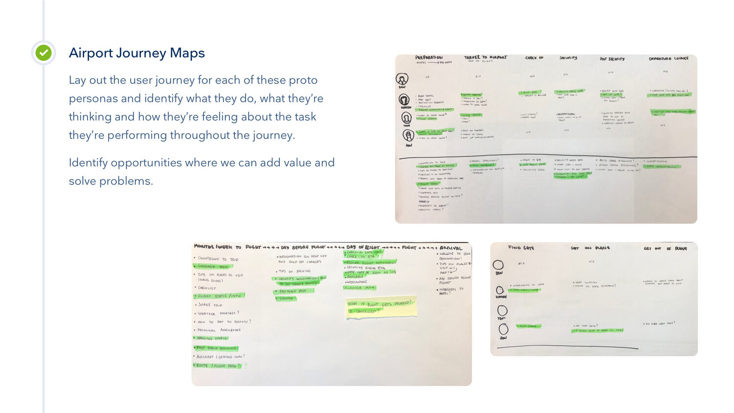
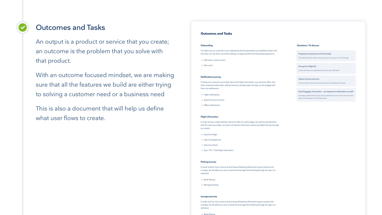
I did not jump straight into Figma. I built proto personas from the research and the assumptions we were making, so we always had a real traveller in mind. Then I mapped the airport journey for each of them, marked where the app could genuinely help, and turned that into outcomes and tasks rather than a feature list.
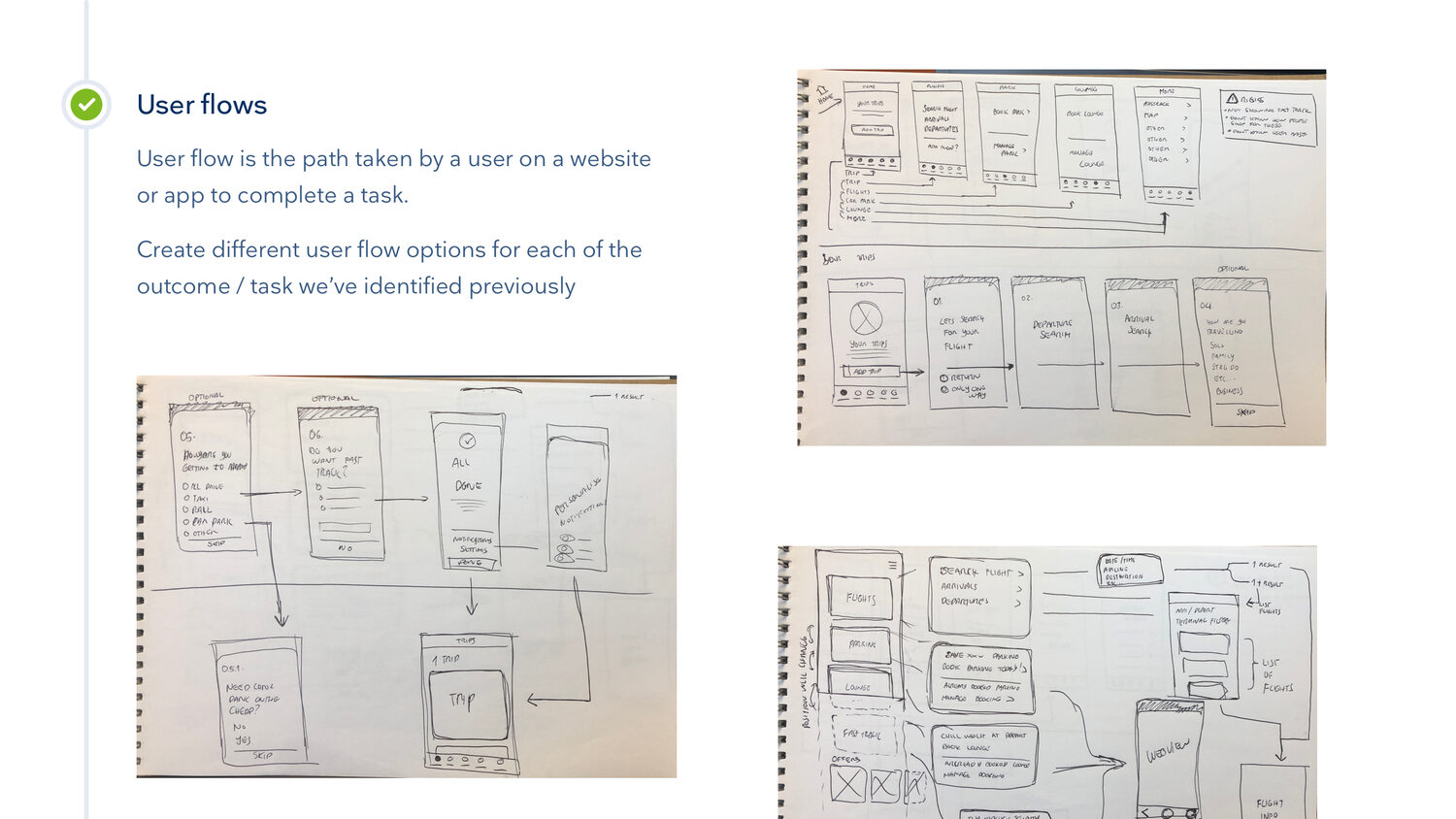
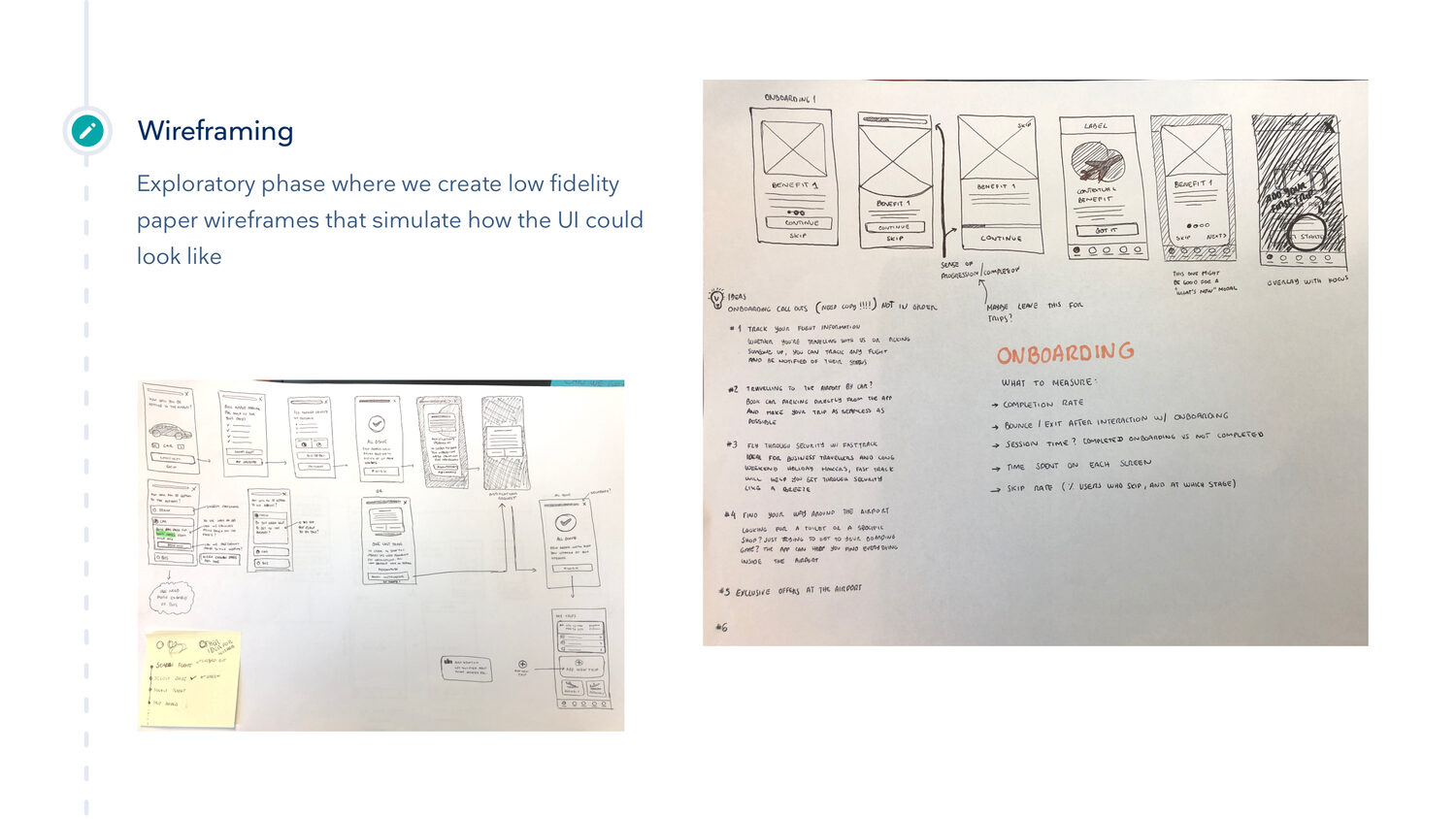
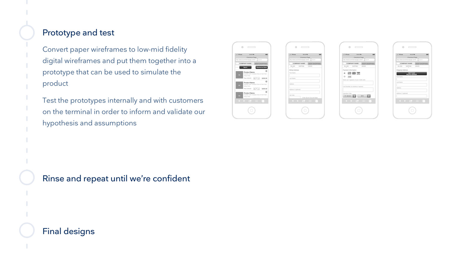
From there it went into user flows, then low fidelity paper wireframes I could test fast, then mid fidelity digital ones stitched into a prototype. I tested that with real customers by the terminal, learned from it, and did it again.
None of it was precious. The whole point of paper was to be wrong quickly and cheaply, in front of real travellers, before anyone built a single screen.
Prototypes I could put in front of people
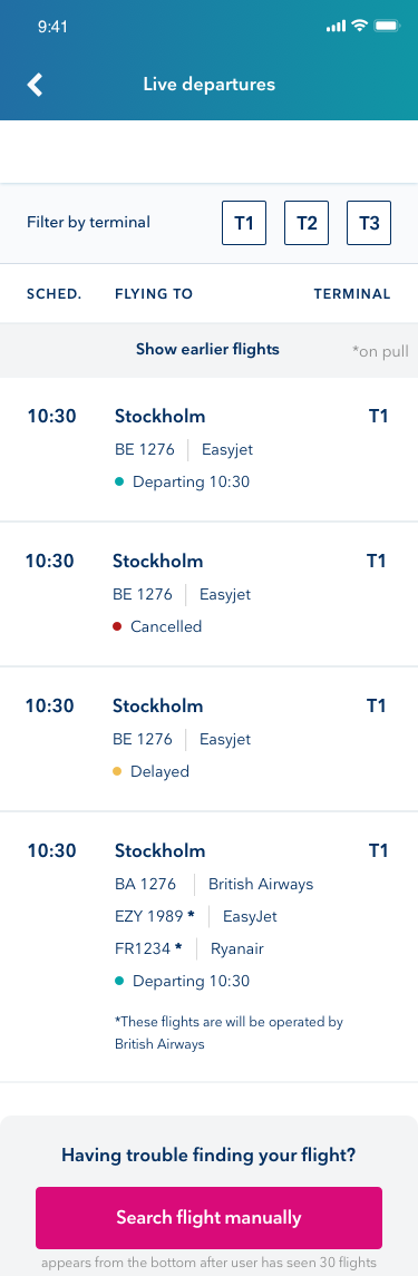
Static screens only get you so far, so I built clickable prototypes and tested the behaviour as well as the look. Onboarding, the offers journey, how the departures and arrivals boards should feel, and the core journey end to end.
Testing the motion and the transitions early saved us from shipping things that looked right but felt wrong.
Three months to ship something real
The full trip-timeline vision was never going to fit the deadline, so we agreed a tighter MVP with senior management:
- Up-to-date flight information from a new API, with tracking and change notifications.
- Booking parking, fast track and lounge access through a web view.
- Airport pathfinding, built on the existing website functionality.
- The supporting bits: contact, lost & found, feedback and rating.
We were based near the airport, so I checked our assumptions with guerrilla testing. I'd walk into the terminal, talk to real customers every day, and iterate week by week.
Getting the app into people's hands
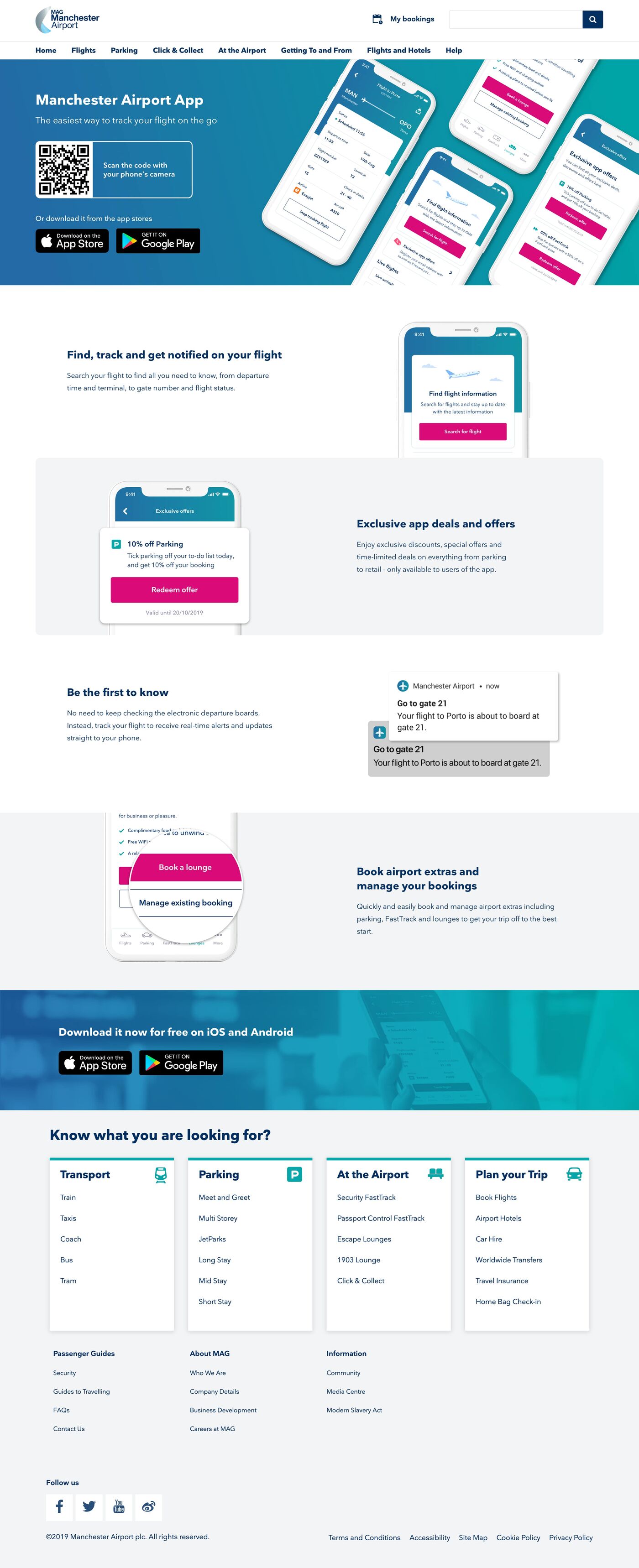
A good app is no use if nobody installs it, so I designed the acquisition side too. A dedicated landing page with a QR code people could scan and install on the spot, a CRM email campaign, and download call-outs built into the existing mag.co.uk journey: the homepage, the megamenu and the flight pages.
Native smart banners on iOS and a custom one on Android caught the people who were already on the site on their phones.
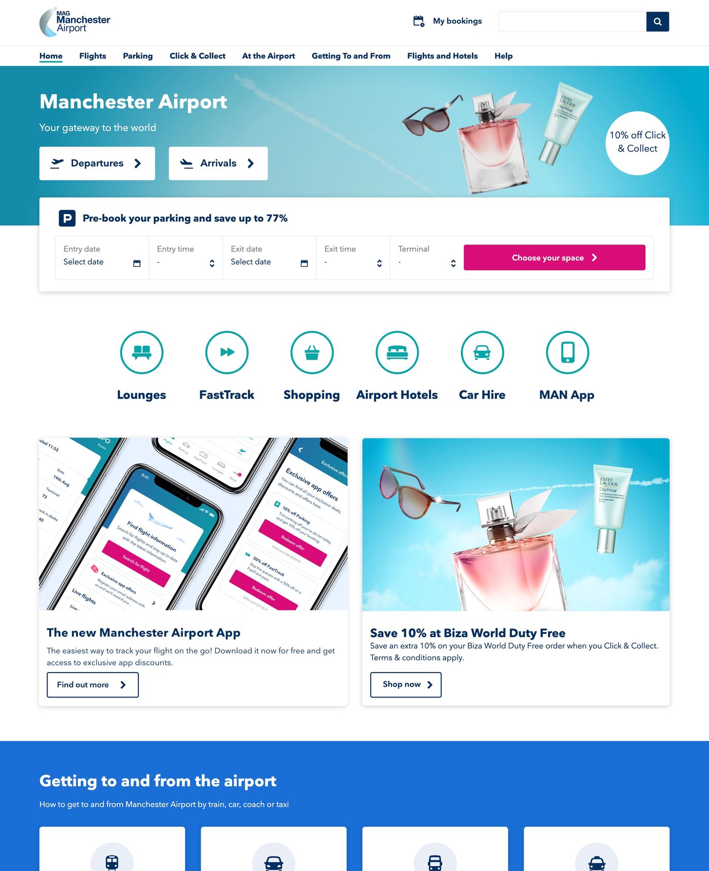
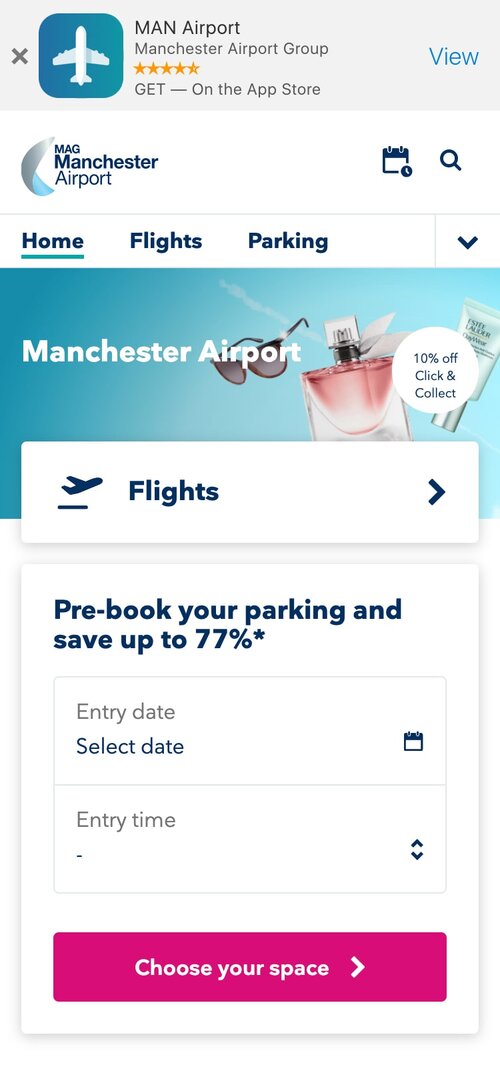
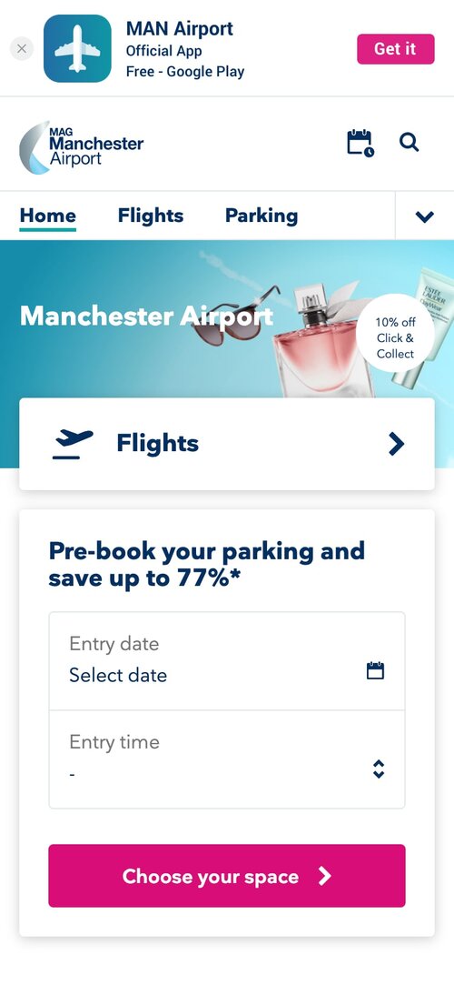
We wanted a clean slate so we knew exactly what customers thought. Acquisition costs won, so we overwrote the old app, and inherited its users.
An honest look at a bumpy launch
As we got close to launch, talk turned to the old airport app. It was a basic web view with a few thousand active users, built by an agency in native code we couldn't easily learn from. We pushed for a clean slate so we'd actually understand our new users, but to keep acquisition costs down, management decided to overwrite the app and hang on to that user base.
We soon found out that most of those users were taxi drivers, and the bad reviews started rolling in, because we hadn't designed for anything they needed. As we pulled more real customers in, we started getting reviews about the airport itself, delayed flights and security queues, rather than the app.
Two sides of the coin
A blended store rating made it really hard to judge the app on its own merits, so we quickly shipped two things: a way for people to report bugs and feature requests, and a survey to pull apart the app experience from the airport experience.
After around 2,000 responses, we could breathe again. Judged on the app alone, the rating sat at about 4.2, while the airport experience came in at 1.6. The feedback also showed real work still to do on notifications, delays and duplicates, which we handed back to the tech team.
A positive experience, lessons and all
The launch wasn't the one we'd pictured, but the numbers came in above forecast and were genuinely healthy. We went on to launch two more apps for MAG's other UK airports before my contract ended. It was my first contracting job and I learned a huge amount, not least that who you launch to matters just as much as what you launch.