A logistics problem hiding on the product page
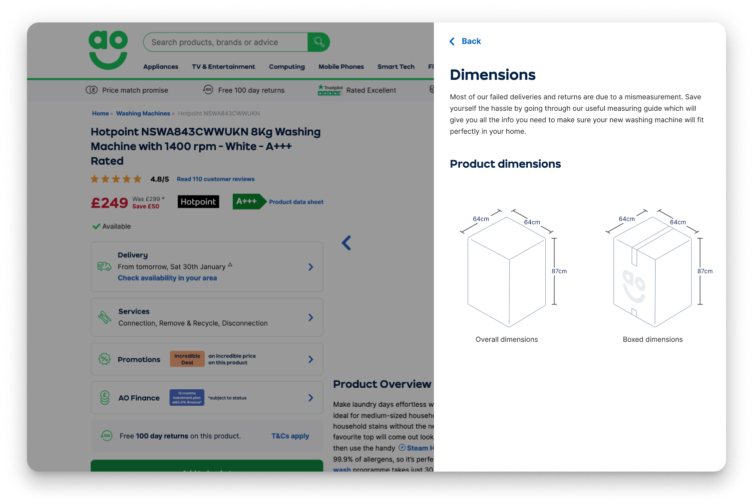
Returns and failed-delivery numbers were going up, so the business asked our team to dig into why. After a round of stakeholder interviews and a discovery session with customers, one thing stood out: dimensions mattered a lot to people, but they were buried on the page and hard to take in.
The survey and the site data disagreed
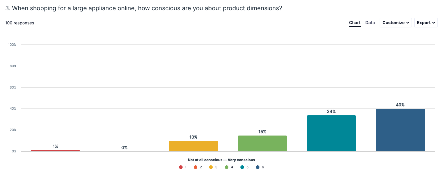
We pulled together every insight we had that touched dimensions, from call-centre data to logistics reports on why deliveries failed, and ran our own survey (n=100). Our UX research team already had too much on, so I picked this one up myself: designing the study, analysing the results and sharing them with the wider business.
The survey said customers were measuring up, and that they knew dimensions mattered. But months of website data told a different story. So we went straight to the source and spoke to the delivery drivers.
The problem wasn't whether people measured. It was what they measured. Pipes behind washing machines. Deep TV stands. Fridge doors that had to line up with the cabinet.
20 categories, 85% of the problem
The drivers were a goldmine. Most returns came down to the same handful of misunderstandings about what to measure:
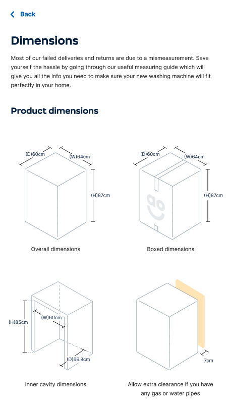
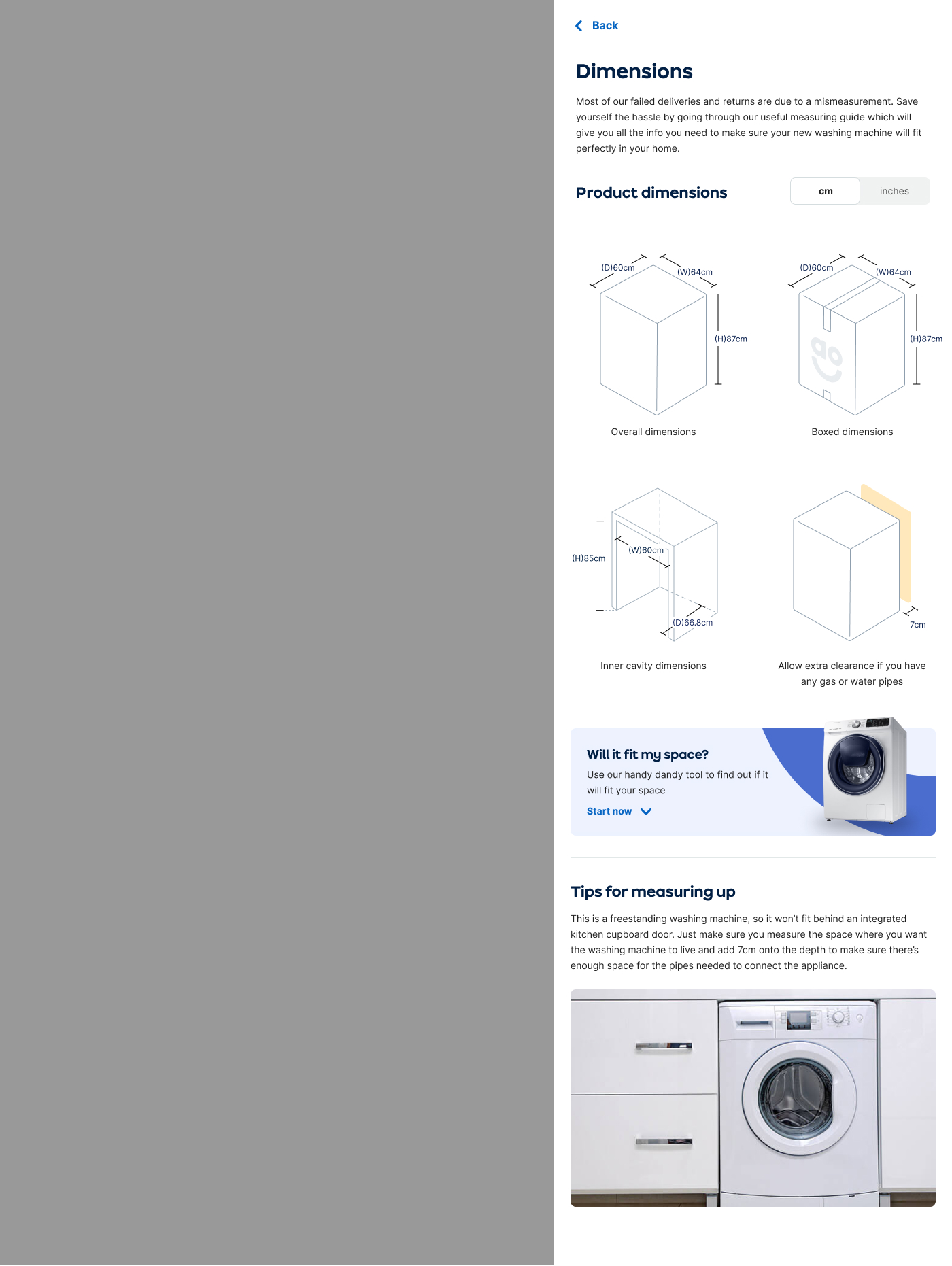
- Washing machines came back because nobody had accounted for the pipes sticking out the back, so the appliance wouldn't sit flush in the cupboard.
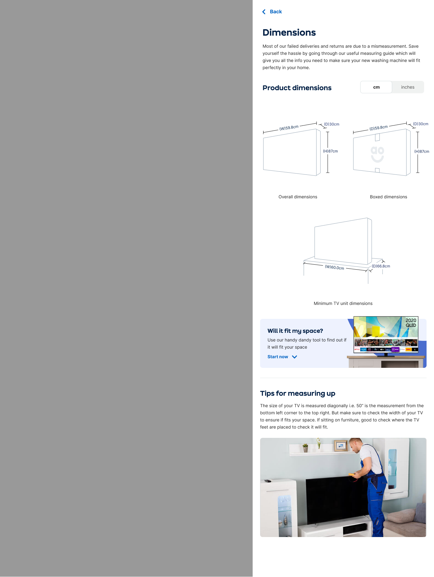
- TVs came back because some stands are deeper than you'd think and didn't fit the customer's unit.
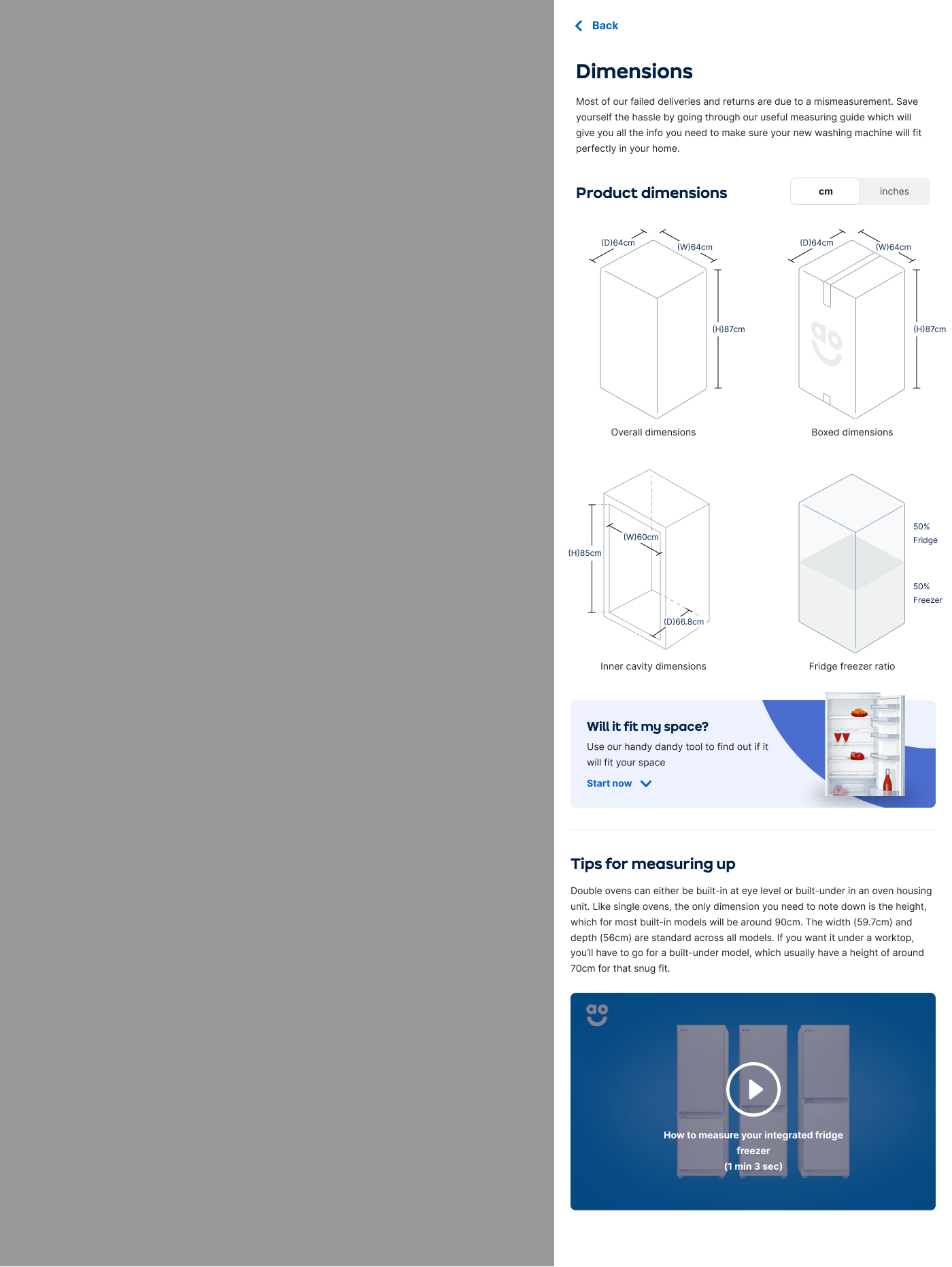
- Integrated fridge-freezers came back because people didn't realise the cabinet doors had to match the split.
We took this back to the business and pinned down 20 categories that made up 85% of all returns and failed deliveries, most of them with one specific customer problem we just weren't communicating clearly.
Ship in slices, learn fast
This was a big technical job, so I drew up a roadmap and testing plan to ship in slices and check the thinking as we went. I ran a preference test first, to see how customers would react to the ideas and which trigger points actually pulled them in.
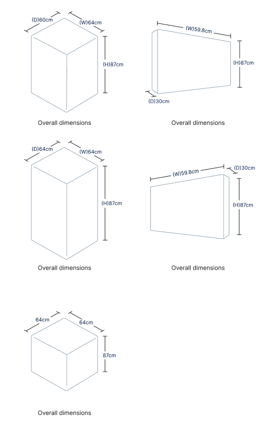
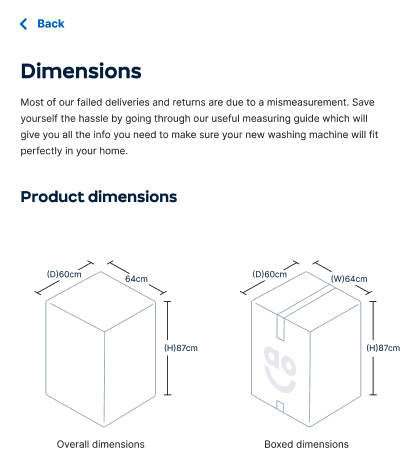
The first MVP was deliberately simple. We dropped triggers throughout the page to draw people into the dimensions, and bandit-tested them against each other. For the content itself, instead of hand-building high-fidelity diagrams for every category, we wrote a little tool that turned the raw dimension data into a generated polygon. Something useful straight away, without a massive dev lift.
From a drawer to "will it fit?"
Each slice went after one of the problems we'd found, and set up the next:
- Slice 1: does showing dimensions visually get people engaging with the content?
- Slice 2: do customers actually want to learn how to measure?
- Slice 3: tackle the specific problems the drivers surfaced, category by category.
- Slice 4: pull the "how to measure" content from the CRM straight onto the page.
- Slice 5, the vision: a catch-all "Will it fit my space?" tool to take away any doubt.
A logistics fix that paid for itself
The MVP results were positive on both engagement and revenue. In the worst categories the financial impact came out flat. In the best, some product pages saw a 15%+ uplift in add-to-basket, and those results reached statistical significance. That added up to a win in the region of hundreds of thousands of pounds a year.
We saw failed deliveries and returns drop too, though it was hard to tie a specific customer who'd seen the experiment to a return weeks later, so we couldn't fully put that down to our work. As tends to happen in fast-moving retail, the win got banked, and the later slices are still sitting on a backlog somewhere, waiting for their moment.