Smart with time, careful with quality
Sam Sharara brought me onto this one. He's a former manager and mentor, and one of the most talented UX people I've worked with. Driver Guardian had been running since 2010 on an old, limited site, and they wanted to invest in ad campaigns while finally giving the website the facelift it needed.
The scale and the timelines meant less time at the whiteboard and more time actually making things. We leaned on more than 20 years of combined CRO experience and some solid heuristics, and didn't cut corners on quality. Most traffic arrived through third-party sites and affiliates, so we put our energy into making the funnel itself as good as it could be.
Accessible colours, reusable foundations
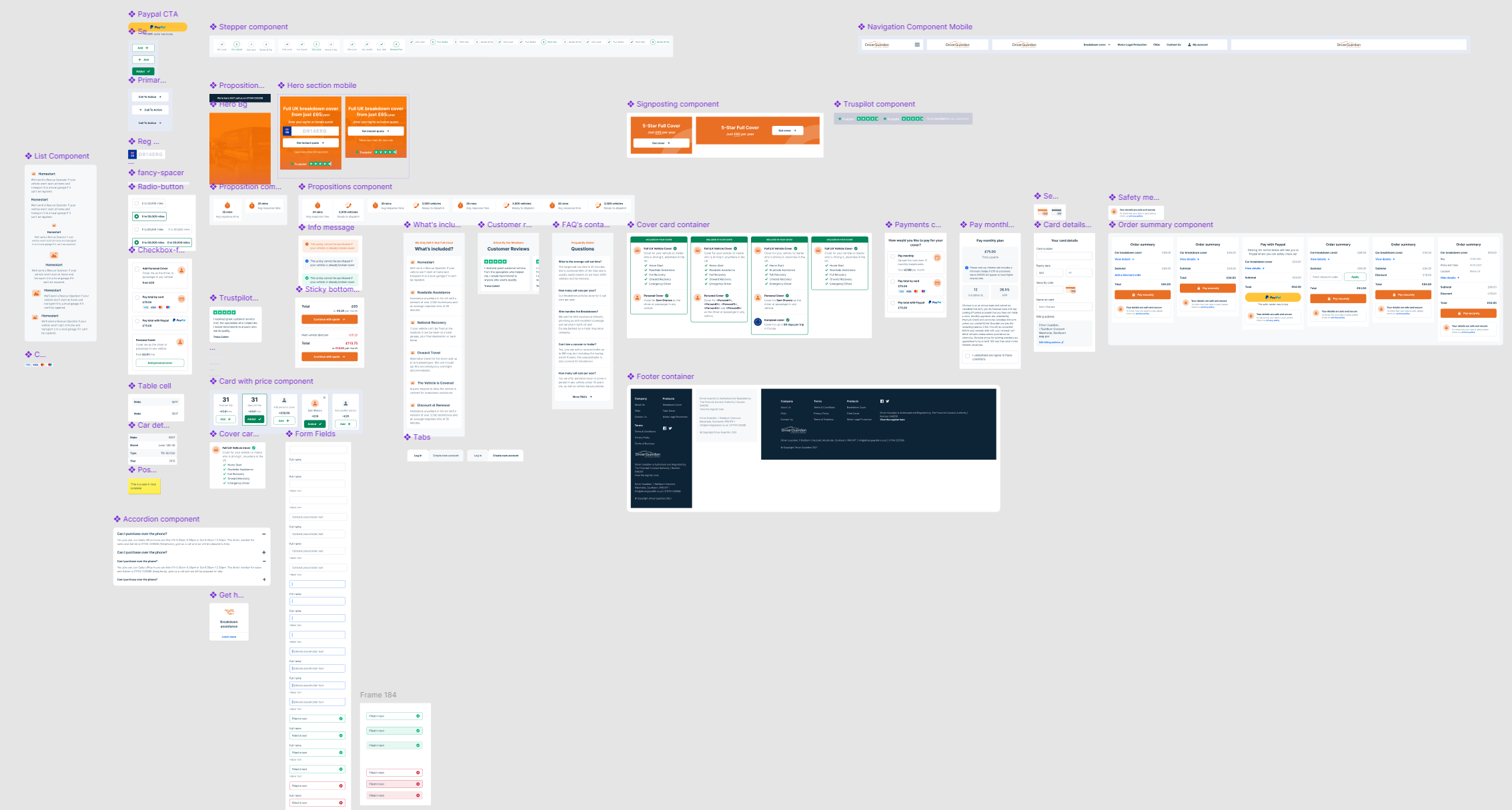
The site was dated on the front and the back end, so there was a real chance to rebuild how things were put together, keeping everything consistent, reusable and easy to change. After some back and forth on colour and accessibility, we landed in a good place: nudging the brand colours until they were accessible without losing the existing identity.
We put together a simple style guide (new colours, text styles and a fresh icon set) and built components that fed off those tokens. A small cost up front to keep everything consistent and light, both in Figma and on the live site. It went over to their dev team later through Figma Dev Mode.
Most traffic landed deep in the funnel, so that's where we lived. Every step made as smooth as it could be.
200+ screens, kept short and sweet
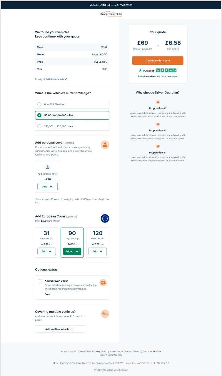
There were over 200 designs across the flows and add-ons, for both mobile and desktop. The big difference between them was on desktop: we split the page so the user could always see the price and the call to action in a sticky right-hand column.
The multi-vehicle journey let companies add a fleet. For fleets over ten vehicles an agent still handles it manually for now, with a clear path to a back-end system (or AI) that reads uploaded documents automatically down the line.
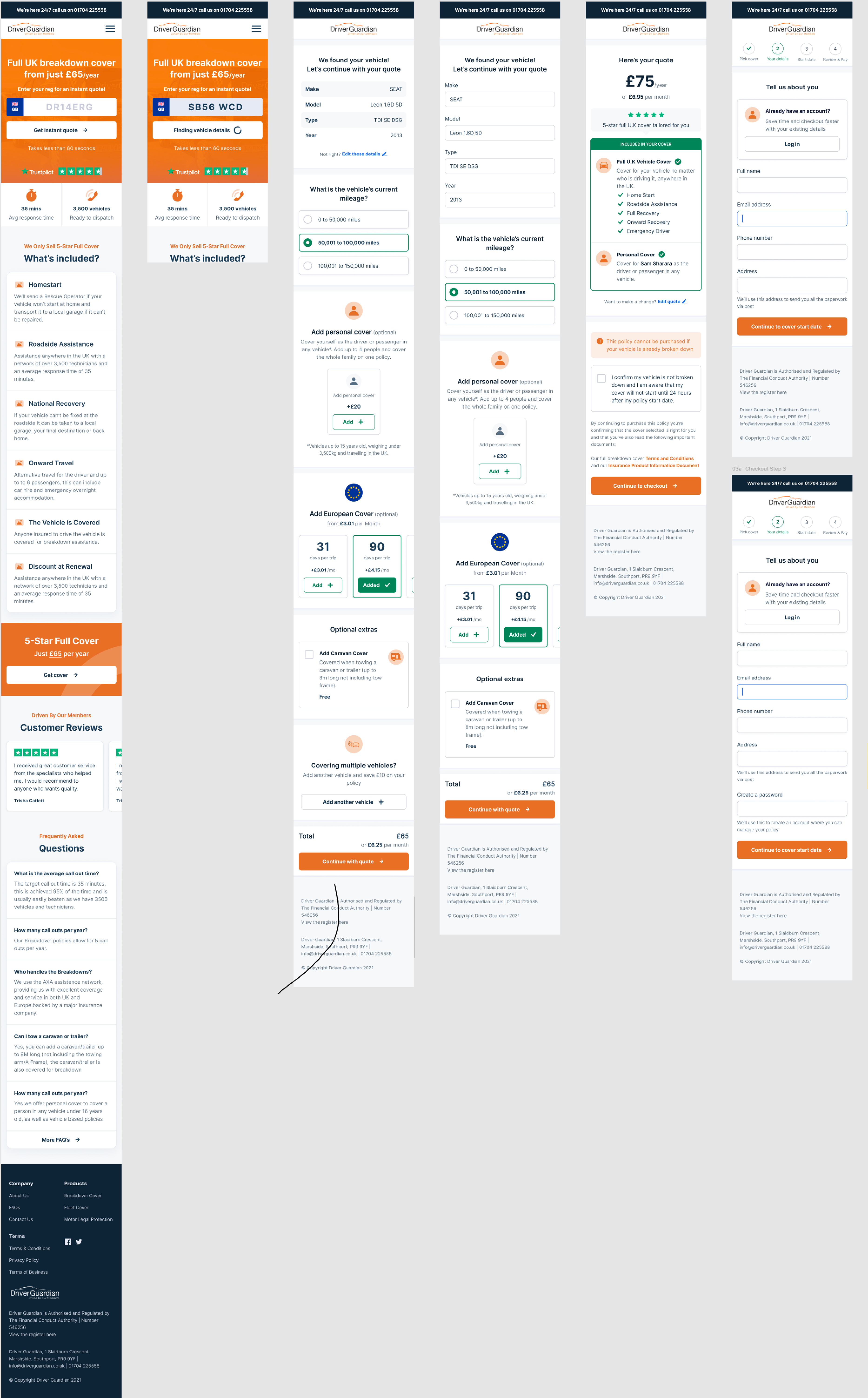
A modular, sales-ready homepage
The homepage carried the new brand and the same modular approach as the funnel, so the team could build future sales pages out of the same blocks. (We pushed to lighten the heavy orange overlay. On that one, we were happily overruled.)
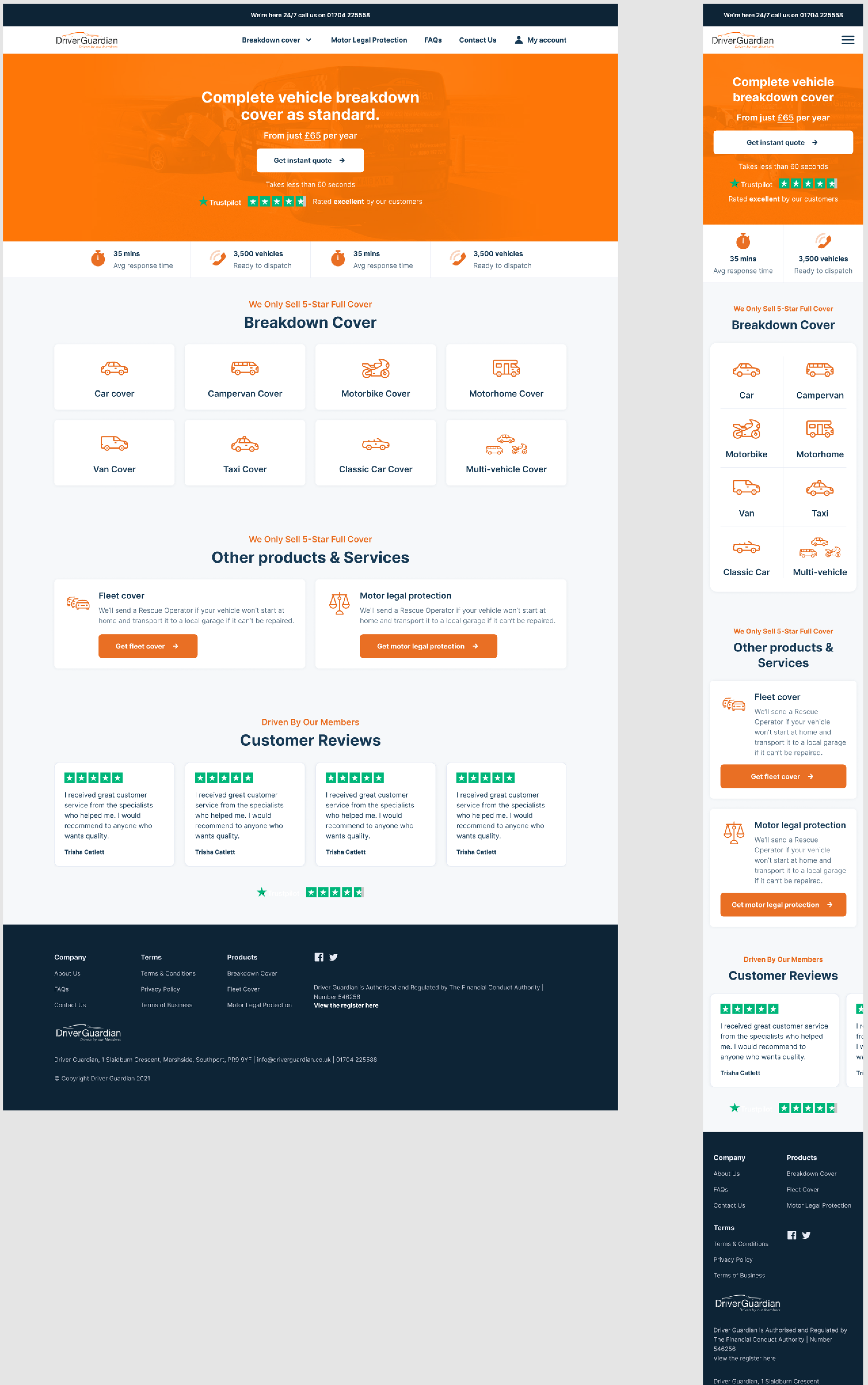
CRM pages and a new account area
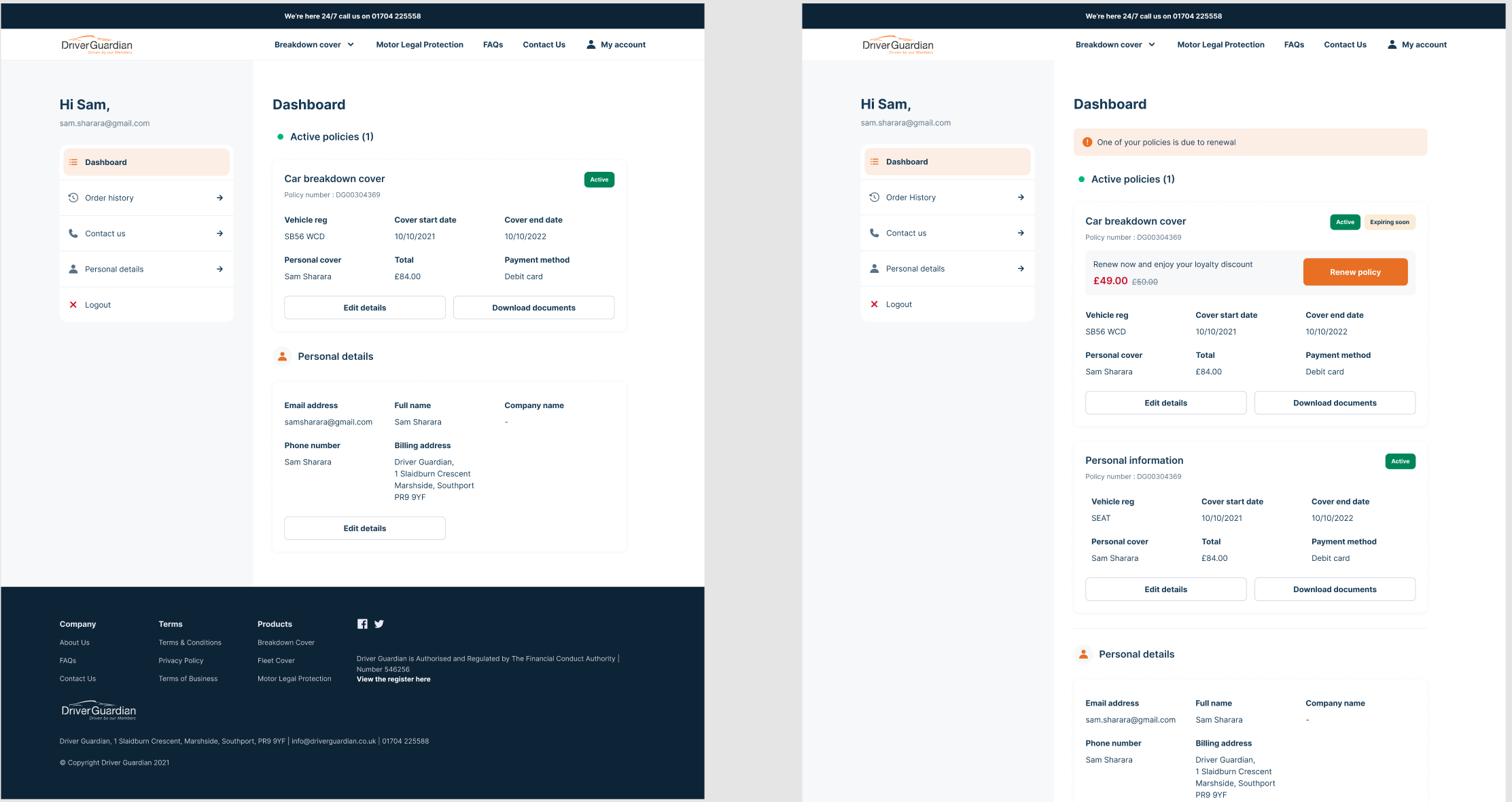
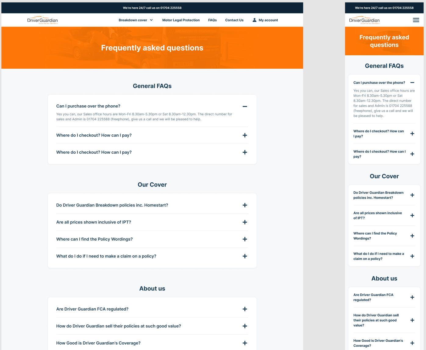
Alongside the core journeys, we built the supporting CRM pages and designed a brand-new "my account" area. It rounded the product out, so the rebuild held together end to end.
Quality at speed
This one was a good reminder that experience and a strong system let you move fast and keep the quality high. Because we invested early in accessible tokens and reusable components, we shipped a big, consistent body of work on a tight timeline, and left the client with foundations they could keep building on long after handoff.