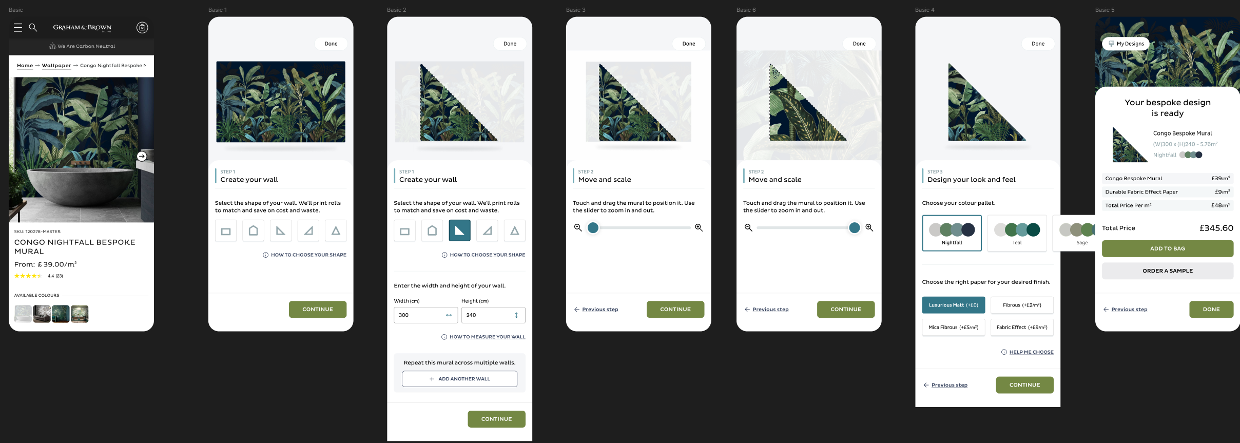
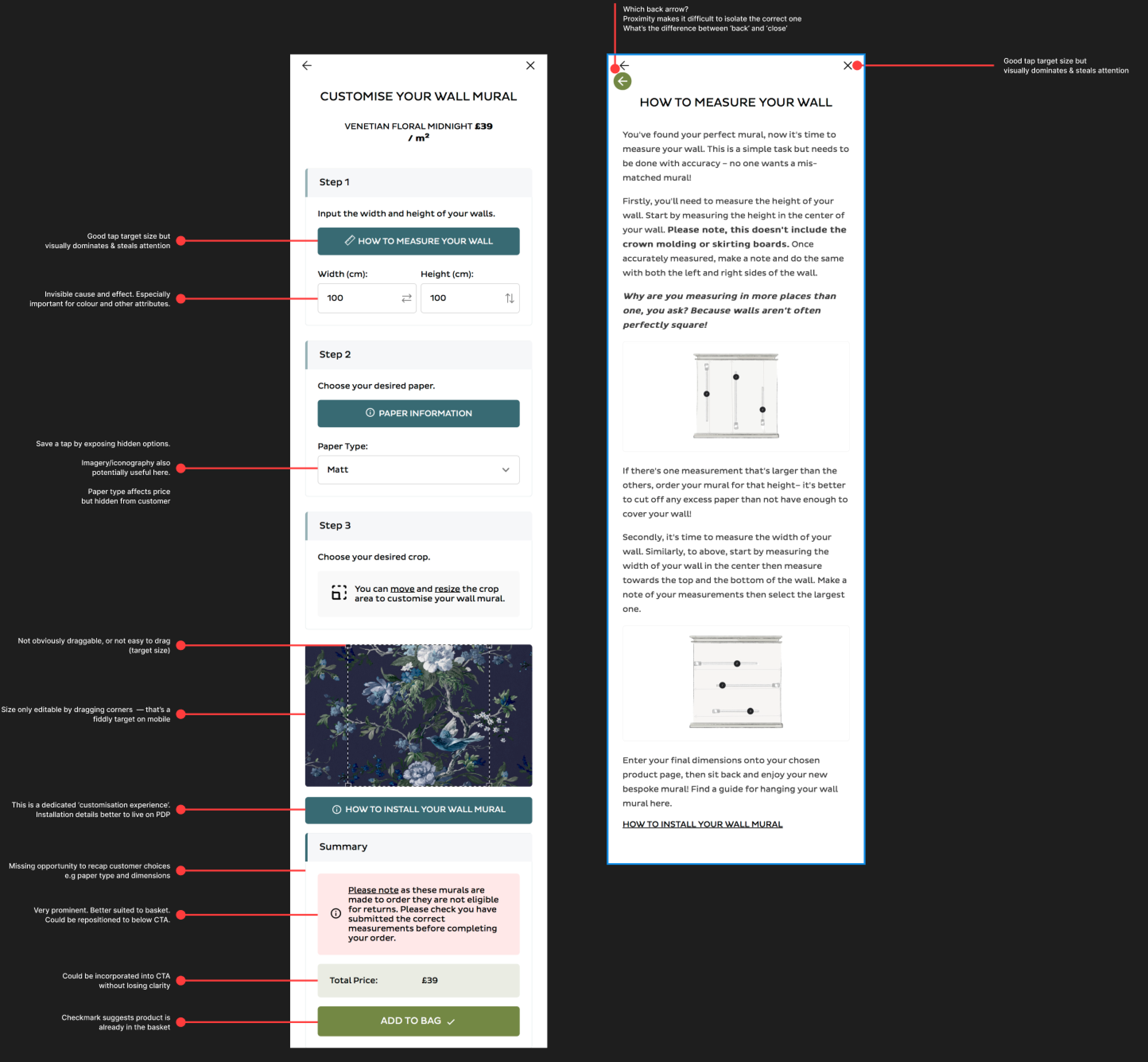
No data? Get creative.
The existing tool had low usage and not much else to go on. The feature wasn't tagged in Google Analytics, and barely any research had been done before launch. So we got creative. We asked partners, family and friends to try it, pulled it apart ourselves, and came out with a clear set of usability issues and opportunities.
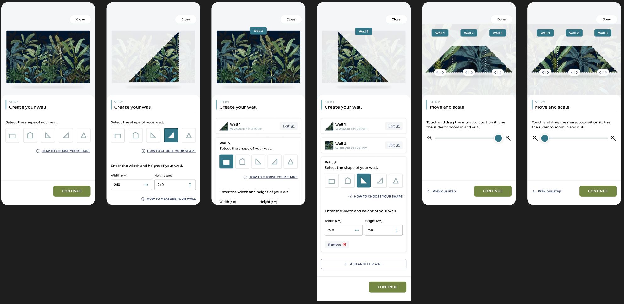
We also learned what was coming down the line: a backend palette system for custom colours, a wish for multi-wall murals, saved designs, and custom wall shapes like stairways and half walls. The redesign had to leave room for all of it.
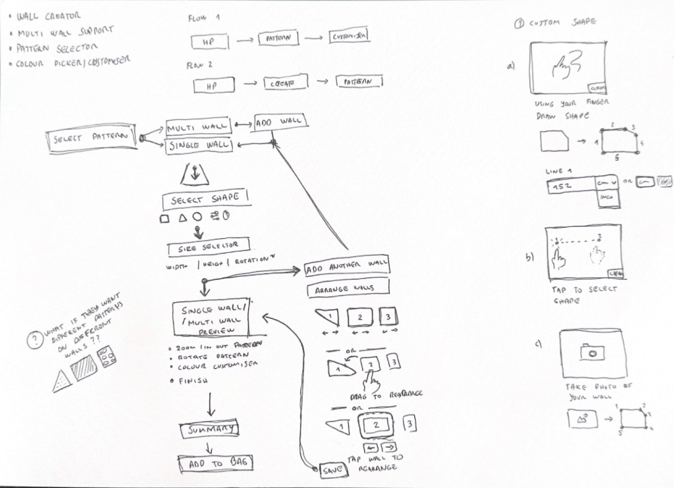
Research, sketches, flows
Before any pixels, we looked at how competitors tackled the same problem and gathered inspiration widely. We had four features to design (creating a mural, multiple murals, the pattern selector and the colour picker), but we started with a single end-to-end flow so each feature made sense next to the others.
A small example: do we ask how many walls up front, or keep it light by letting people build the first wall and only then offer more? Little calls like that shaped the whole journey.
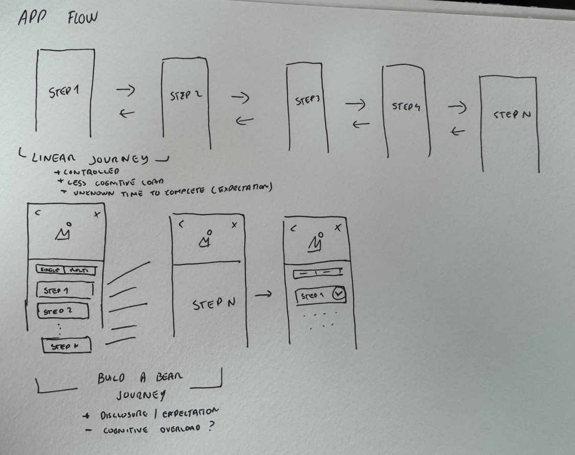
Selling a modular approach
With no design system to lean on, we built our own components and styles from patterns already on their website. A few days in, we pitched the stakeholders a modular architecture for the tool. It would let us:
- Ship smaller pieces of functionality more quickly.
- Test assumptions with multiple versions of the same module and A/B tests.
- Iterate faster on feedback and results, and stay flexible for whatever came next.
- Keep cognitive load low, because the tool can be daunting the first time you use it.
They were pleased with the progress and the approach. So we continued.
Prototype, test, repeat
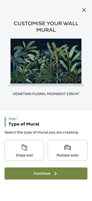
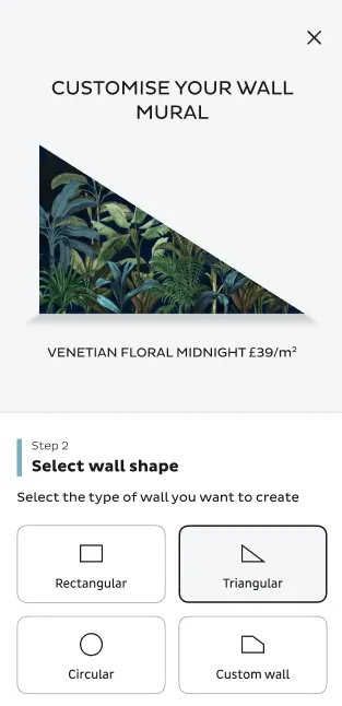
Midway through, we built our first prototype of the new journey and ran guerrilla tests with friends and family. Results were positive, with clear things to fix, so we went back to work.
The full journey, delivered in slices
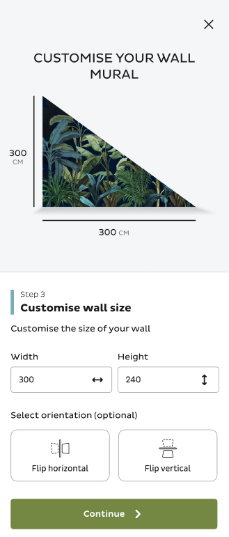
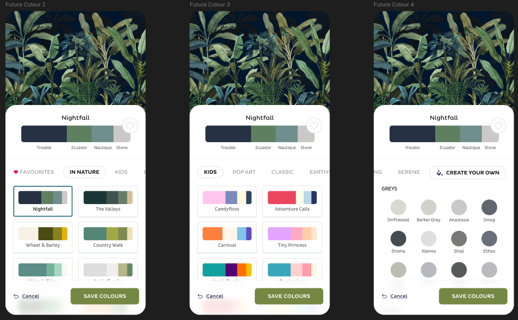
The first slice shipped the standard journey on the existing SKU-based colour picker, the modular framework everything else slots into. After that came future palette concepts for when their backend personalisation system is ready, the multi-mural experience (plenty of iterations against real technical constraints), and saving and retrieving designs.
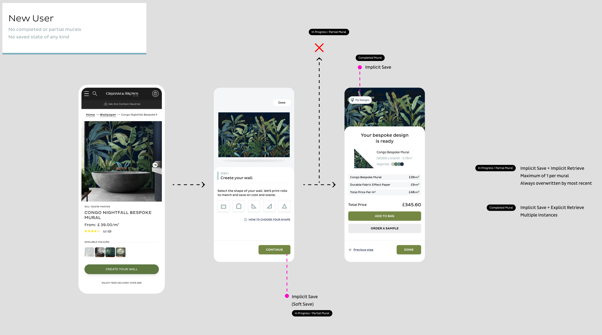
The save experience is the part I'm proudest of. It's nearly invisible. Start a mural and we save it quietly in the background, to cookies if you're logged out, to your account if you're in. Close the tab by accident and you pick up where you left off. Finish but don't check out, and we'll offer to resume next time.
Handed over, set up to learn
My part ended at handoff, and Sam took the work forward to Graham & Brown. No fancy analytics to share this time (that's exactly why we pushed for the tagging), but the tool now ships in modular slices that can be measured, tested and improved. Maybe we'll be back for round two.